Our Brand Guidelines

This online resource has been created to ensure our brand is presented consistently and authentically across all platforms. Within these guidelines, you will find comprehensive instructions for using our logo, colour palette, typography, and more. By adhering to these standards, we can project a unified and professional image that embodies our values and mission, thereby reinforcing our brand identity in the market.

Logo

Our logo features the two 'L's in our company name, LeisureLabs, creatively transformed into a fast-forward icon. This design symbolises LeisureLabs' commitment to propelling the business trajectory of fitness and wellness companies through innovation and technology. The interlocking of the 'L's underscores our mission to foster growth through strategic partnerships and collaboration.

LeisureLabs logo

The safety zone around the logo is defined by the height of the ‘L’. However, the more space, the better

Colour palette

Our chosen colour palette reflects our brand’s core values and visual identity. Navy blue represents reliability and strength, providing a solid foundation. The vibrant blue adds a dynamic and trustworthy element, enhancing our approachability. Green signifies growth and innovation, highlighting our commitment to progress. Together, these colours create a cohesive and distinctive look that reinforces our brand's message across all platforms.

Navy blue

#002744

Vibrant blue

#0060B9

Green

#00DFA1

Brand gradient

#00DFA1 - #0060B9

Typography

For headers, we use Lexend Medium and Bold, chosen for their modern look and readability. For body text, we prefer Lexend Extra Light for its clean, neutral style, ensuring ease of reading and complementing our headers well. Together, these fonts enhance our communications and maintain a clear visual hierarchy.

AaBbCc123

ABCDEFGHIJKLMN OPQRSTUVWXYZ

abcdefghijklmno
pqrstuvwxyz 1234567890

Lexend Medium/Bold
Heading font

AaBbCc123

ABCDEFGHIJKLMN
OPQRSTUVWXYZ

abcdefghijklmno
pqrstuvwxyz 1234567890

Lexend Extra Light
Body font

Icons

Our icons are designed to enhance communication, featuring linear designs in our signature gradient or solid brand colours for versatility. They are crafted to display clearly on both light and dark backgrounds, enhancing accessibility and consistency throughout all brand touchpoints.

Images

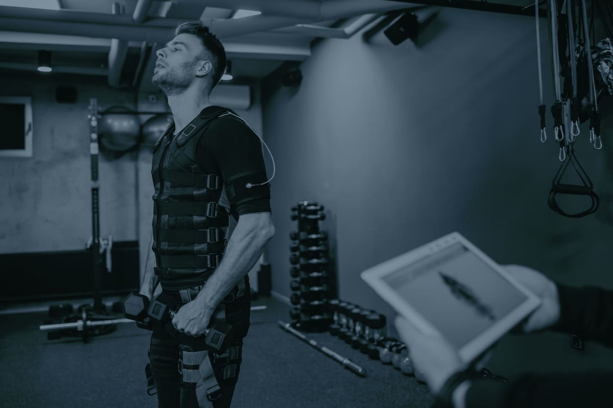
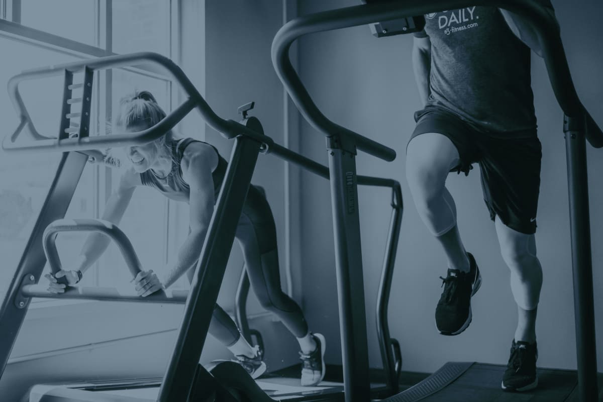
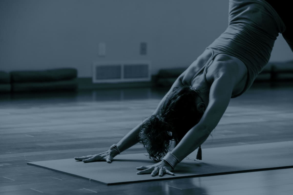
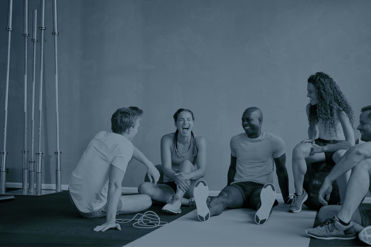
Our imagery emphasises movement, action, and progress to reflect our dynamic approach. When relevant, we incorporate photos featuring multiple individuals, underscoring our commitment to shaping the future of fitness and wellness through partnership and collaboration. Our selected images are predominantly set in gyms, leisure centres, workplaces, and homes, reinforcing the breadth of our influence across various environments.

To achieve visual cohesion, we use black and white images with our navy blue color at 50%, blend mode darken. This may vary if we need to place legible text over the image.

Our language

Is

Clear

Concise

Engaging

Inclusive

Isn't

Vague

Wordy

Technical

Alienating

Our voice

Is

Personable
We are always relatable and easy to understand

Informed
We speak from our experience and subject matter knowledge

Supportive
We have great respect for our team and our customers

Honest
We speak with integrity and in a way which builds trust

Inspiring
We always promote innovation and future thinking

Isn't

Detached
We are never impersonal or disinterested

Theoretical
We are always practical and outcome oriented

Arrogant
We are never overly opinionated or pompous

Overly technical
We always strive to simplify the most complex of subjects

Overly formal
We are always professional without being pretentious